
Logo Design & Branding that looks premium and stays consistent
We build brands like engineers and artists at the same time. A distinct mark, a clean logotype, a defined color system, and repeatable design elements that work across your website, social, print, and merch.
A professional, repeatable branding process
You get a brand that is visually strong and operationally usable. Every decision is documented so the look stays consistent as you grow.
A brand is more than a logo. The kit makes your designs consistent even when multiple people touch the brand.
- Primary logo, secondary logo, icon-only mark
- Light and dark variants
- Clear space and minimum size rules
- Color palette with hex codes
- Typography pairing recommendations
- Reusable shapes and motifs for backgrounds and accents
- Social profile and favicon-ready exports
That is why we define exact colors, spacing, and repeatable elements. Your website, cards, and social all feel like one system.
Logo Design Deliverables & Scope
Every logo design project includes comprehensive deliverables to ensure your brand is ready for any application.
Creative Process
- Concept sketching (3–5 initial concepts)
- Typography exploration
- Icon/mark development
- Color palette development
- Iteration rounds (2–3 revisions)
- Final logo selection
Final Deliverables
- Primary logo
- Secondary logo
- Favicon
- Black and white versions
All logos delivered in multiple formats including PNG, JPG, SVG, and AI for maximum compatibility.
Every project includes revision rounds to ensure your complete satisfaction. We work with you until your logo perfectly represents your brand vision.
Three brands, three completely different visual worlds
Each brand below represents a complete visual world. Scroll through to experience how consistent branding creates unforgettable companies.
PRECISION • PERFORMANCE • DOMINANCE
Born from obsession with uncompromising performance. Engineered for those who demand absolute control.
THE SKORPIOS
Engineered to Sting
Icon System
Custom performance iconography
Typography System
Aggressive sans + technical numeric
Color & Material Palette

Brand Design Philosophy
Aggressive • Precise • Unforgettable
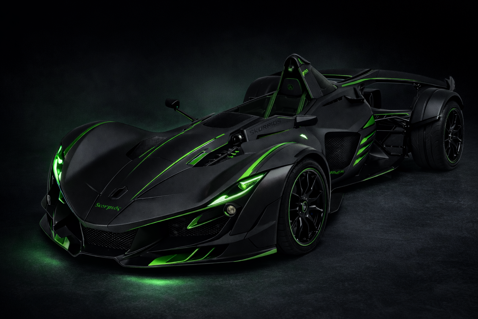
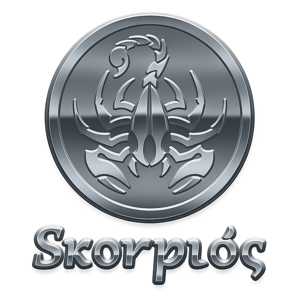
For Skorpios, we needed a brand identity that matched the raw intensity of a single-seater track weapon. The scorpion icon represents precision and danger—a perfect metaphor for performance engineering.
The neon green (#0ADA13) cuts through darkness like headlights on a night run. Paired with carbon black and industrial steel tones, the palette feels futuristic, mechanical, and venomous. The typography is sculpted and assertive, blending forged-metal weight with subtle gothic and classical serif influences. It carries controlled curves, flared terminals, and refined stroke contrast, giving it both elegance and menace rather than sharp minimalism.
Brand Applications
Identity system deployed across all touchpoints
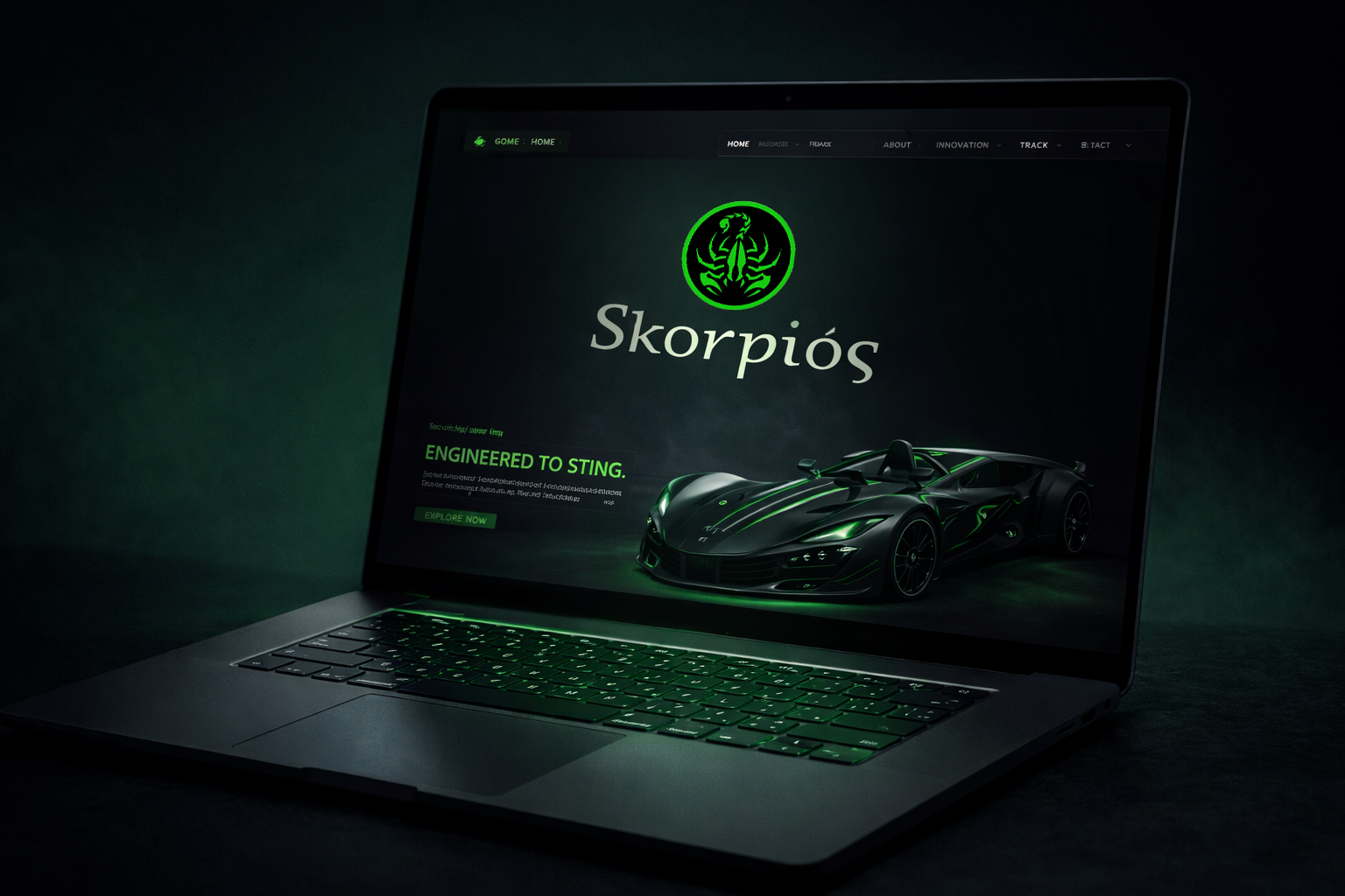
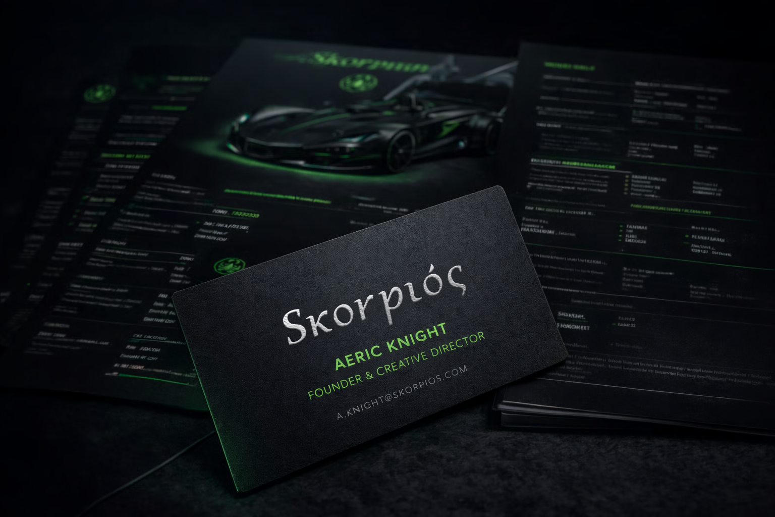
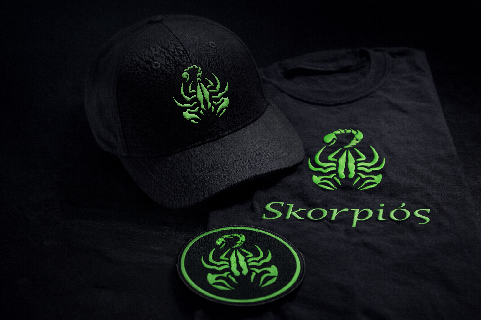
Engineered to Sting
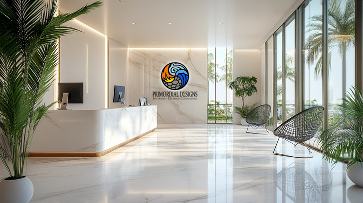
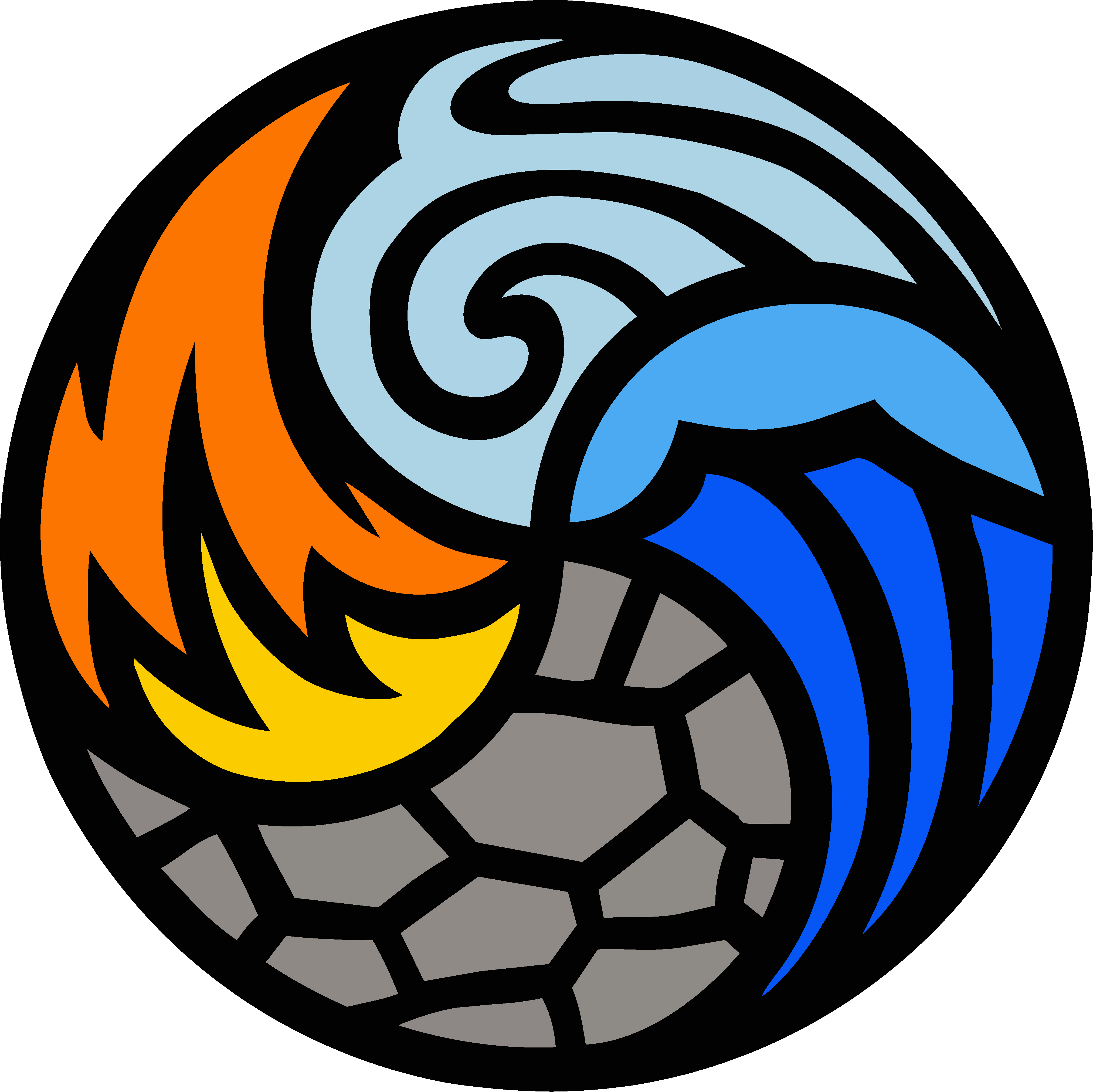

Sophisticated Studio Identity
For this interior design studio, we created a refined brand identity centered on elemental symbolism—fire, water, air, and earth—unified in a circular mark that represents balance and harmony. The brand embodies their philosophy that great design emerges from the thoughtful integration of natural elements.
Brand Identity • Visual System • Collateral Design
Brand Foundation
Color system crafted for sophistication
Color Palette
Brand Touchpoints
Where the brand comes to life
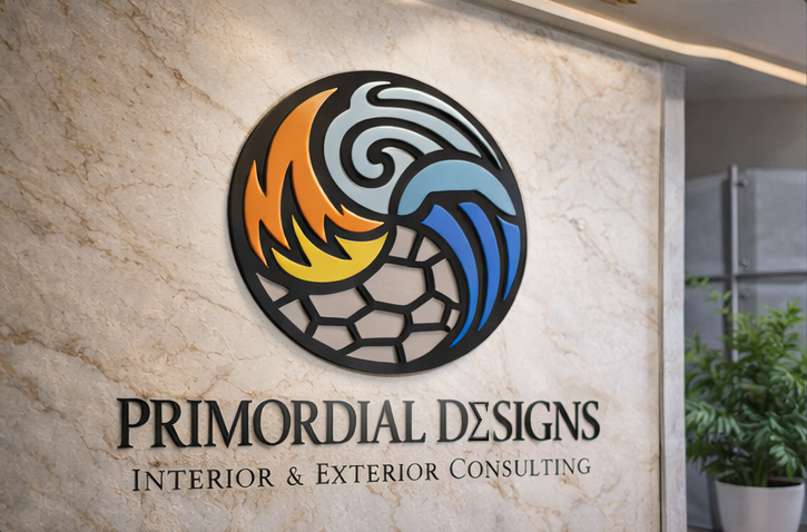
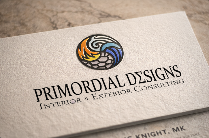
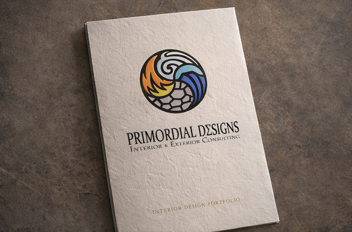
Brand Identity Design
This example demonstrates our approach to creating sophisticated, timeless brand identities for service-based businesses. We developed a complete visual system including logo suite, color palette, typography standards, and application guidelines—ensuring consistent brand expression across all touchpoints.
Where Elements Meet Design
Warm, Playful, and Made to Be Shared
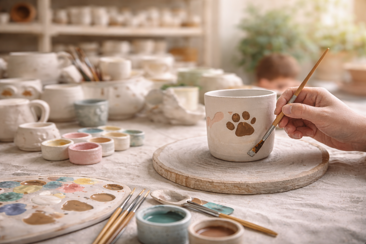
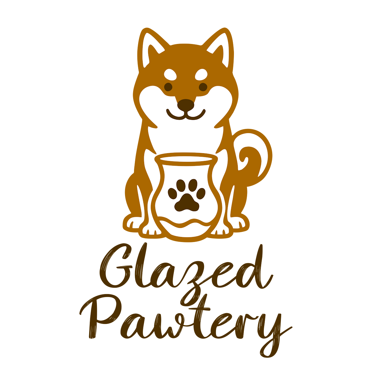
We built the Glazed Pawtery identity around what the studio actually sells: an experience. Guests choose a piece, paint with studio glazes, and we fire it for a finished keepsake that lasts. The name and mark are a nod to the owners’ three Shiba Inus, bringing personality, warmth, and a little mischief into the system.
The visual language balances cozy and premium: soft neutrals, friendly typography, and a paw-forward icon set that feels at home on signage, cups, packaging, and event materials.
Studio Brand Identity • In Store Experience • Packaging and Labels • Event Materials
The Studio Experience
Choose Your Piece
Pick from a range of bisque figurines, mugs, and more.
Pick Your Glazes
Choose your favorite colors from our glaze wall.
Paint Your Story
Get creative! Add your own paws, patterns, and details.
We Fire It
We expertly glaze and fire your pottery to perfection.
Brand Foundation
Studio glaze palette and warm neutral system
Glaze Collection
Studio Brand Development
This case study highlights a full studio identity system designed for a paint-your-own pottery experience. The work includes a flexible logo suite, paw icon set, warm palette, in-studio signage direction, packaging and label templates, and event-ready assets that scale across seasonal promotions.
Made with love and a little Shiba mischief
Ready to build your brand?
Let's create a visual identity that stands out and stays consistent across every touchpoint.